
Students in Kindergarten are creating a heart project that reinforces the vocabulary word balance and mosaic. We likened balance (symmetry) in art to a scale. When a piece of art is “heavy” on one side we feel that the art is out of balance, but when we find shapes to match the other half, it gives a feeling of balance.

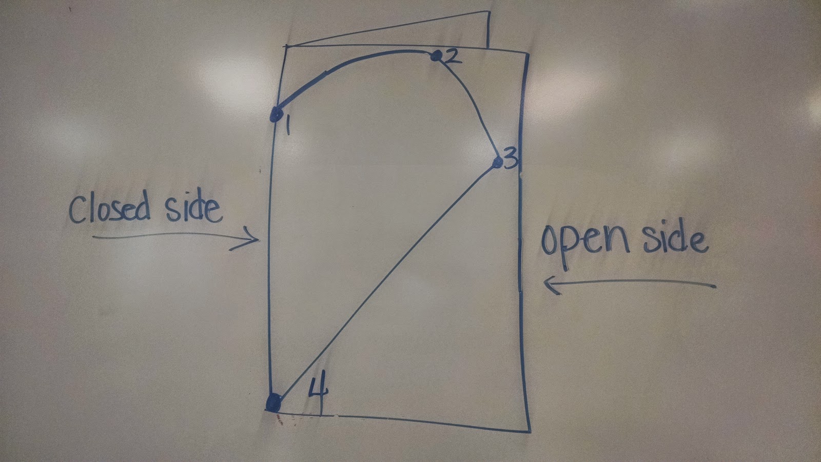
Once the concept of balance and symmetry was introduced, students created their own symmetrical balanced heart that has matching rather than lopsided halves. We first practiced on small 4"x4" red paper and then moved onto larger 12"x18" tag board. The first step was to fold our paper in half vertically (hamburger style). As a class, we discussed how our paper now has an open and closed side. On the closed side, students placed their five fingers (2 fingers for the smaller paper) pinkie at the top of the paper and made a dot below their thumb on the folded edge (closed side).

Students drew half a heart starting with the dot along the edge and continued drawing their line to the top of the paper, to the far side, and back down to the bottom corner on the fold side. For students who had difficulty with this step, dots were drawn by the teacher and connected by the students (see photo below).

Once the concept of balance and symmetry was introduced, students created their own symmetrical balanced heart that has matching rather than lopsided halves. We first practiced on small 4"x4" red paper and then moved onto larger 12"x18" tag board. The first step was to fold our paper in half vertically (hamburger style). As a class, we discussed how our paper now has an open and closed side. On the closed side, students placed their five fingers (2 fingers for the smaller paper) pinkie at the top of the paper and made a dot below their thumb on the folded edge (closed side).

Students drew half a heart starting with the dot along the edge and continued drawing their line to the top of the paper, to the far side, and back down to the bottom corner on the fold side. For students who had difficulty with this step, dots were drawn by the teacher and connected by the students (see photo below).
Once all papers were checked by the teacher for correctly starting and finishing on the fold side, students were able to cut on the heart line, cutting two papers at the same time, while the paper remained folded. If cutting and drawing were completed correctly, a symmetrical whole heart could be found when the students opened their papers. Sometimes, If I don't keep my eyes open, we could find two half hearts instead of one whole heart. This is what happens when students work on the open side instead of the fold side.
 |
| Oooops! |
After creating our balanced and symmetrical heart shape, students then divided one half of their heart into sections by drawing straight lines from one side of their heart to the other side or from one black line to another black line with a black oil pastel to create a mosaic. The paper heart is then folded in half and rubbed with an old gift card to transfer symmetrical lines to the other half of the heart, ending with a mosaic effect. At the end of this week and next week, everyone will have the opportunity to paint inside each shape using tints and shades of one color (monochromatic color scheme). To make the paint values balanced and matching on both halves of the heart, students close their heart shape along the fold line after painting a shape. Students then rub to transfer the painted values to the opposite side of the heart making a "balanced" symmetrical shape.


When I purchase paint for my classroom, I rarely purchase secondary colors like orange, purple and green. I love color theory and really encourage my students to mix their own secondary colors, as well as any tints and shades they may need, even at the kindergarten level. For example, the heart below uses only purple and its tints and shades. To make purple, students must use the two primary colors red and blue in the right ratios to make purple. To keep it simple, students will only be working with a light, medium and dark value of one color. To use purple, it must be mixed from the primary colors, because I do not have any purple paint in my art room.

Crayola is not a sponsor of Art Teacher 101, but I really do like their paint! After the hearts are painted and dry, we will add them to a colored piece of construction paper matching the color used on the heart.


