I don't know about you, but this cold weather has me dreaming about warmer days. We were spoiled not too long ago with warm temperatures hitting the 70's and wishful thoughts of flowers in bloom and leaves sprouting on trees, but then the true South Dakota reality of frigid temperatures returned with temperatures as low as the teens. Weeks like this make me wish for warmer days and these thoughts sometimes inspire activities in the art room.
Kindergarteners continued working with balance and symmetry and created beautiful butterflies to decorate and brighten our hallway. Students started by folding a large 12"x18" paper in half and using black tempera paint, drew one half of the butterfly's wing (number 3), folded their paper in half, rubbed the back, opened the paper again, and saw a completed butterfly with a symmetrical reflection on both halves.
After using black tempera to add shapes and lines to the wings (and then folding and rubbing to match the opposite side to create symmetry), students then used tempera paint cakes to add color to the wings continuing with the symmetry theme, mirroring their color choices. After papers dried, students had the choice of cutting out their butterflies or keeping the butterflies as is and painting a spring inspired background around the butterfly.
Kindergarteners (all four sections) also worked on a large collaborative mural, using tempera paint to create a spring scene. Students were given paint brushes and tempera paint and told to think spring! It turned out beautiful and can be seen just outside the kindergarten wing in our building. Because I do not purchase secondary colors for my classroom, when choosing orange, green or purple paint to use on the mural, students had to consider what primary colors were needed to mix.
Showing posts with label color theory. Show all posts
Wednesday, March 15, 2017
Thursday, January 19, 2017
"Balanced" Hearts
Students in Kindergarten are creating a heart project that reinforces the vocabulary word balance and mosaic. We likened balance (symmetry) in art to a scale. When a piece of art is “heavy” on one side we feel that the art is out of balance, but when we find shapes to match the other half, it gives a feeling of balance.
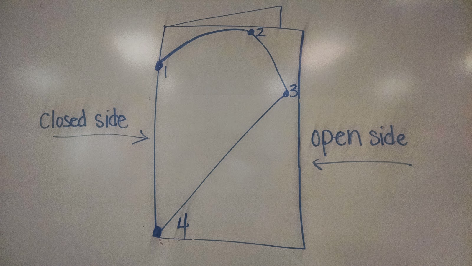
Once the concept of balance and symmetry was introduced, students created their own symmetrical balanced heart that has matching rather than lopsided halves. We first practiced on small 4"x4" red paper and then moved onto larger 12"x18" tag board. The first step was to fold our paper in half vertically (hamburger style). As a class, we discussed how our paper now has an open and closed side. On the closed side, students placed their five fingers (2 fingers for the smaller paper) pinkie at the top of the paper and made a dot below their thumb on the folded edge (closed side).
Students drew half a heart starting with the dot along the edge and continued drawing their line to the top of the paper, to the far side, and back down to the bottom corner on the fold side. For students who had difficulty with this step, dots were drawn by the teacher and connected by the students (see photo below).
Once the concept of balance and symmetry was introduced, students created their own symmetrical balanced heart that has matching rather than lopsided halves. We first practiced on small 4"x4" red paper and then moved onto larger 12"x18" tag board. The first step was to fold our paper in half vertically (hamburger style). As a class, we discussed how our paper now has an open and closed side. On the closed side, students placed their five fingers (2 fingers for the smaller paper) pinkie at the top of the paper and made a dot below their thumb on the folded edge (closed side).
Students drew half a heart starting with the dot along the edge and continued drawing their line to the top of the paper, to the far side, and back down to the bottom corner on the fold side. For students who had difficulty with this step, dots were drawn by the teacher and connected by the students (see photo below).
Once all papers were checked by the teacher for correctly starting and finishing on the fold side, students were able to cut on the heart line, cutting two papers at the same time, while the paper remained folded. If cutting and drawing were completed correctly, a symmetrical whole heart could be found when the students opened their papers. Sometimes, If I don't keep my eyes open, we could find two half hearts instead of one whole heart. This is what happens when students work on the open side instead of the fold side.
![]() |
| Oooops! |
After creating our balanced and symmetrical heart shape, students then divided one half of their heart into sections by drawing straight lines from one side of their heart to the other side or from one black line to another black line with a black oil pastel to create a mosaic. The paper heart is then folded in half and rubbed with an old gift card to transfer symmetrical lines to the other half of the heart, ending with a mosaic effect. At the end of this week and next week, everyone will have the opportunity to paint inside each shape using tints and shades of one color (monochromatic color scheme). To make the paint values balanced and matching on both halves of the heart, students close their heart shape along the fold line after painting a shape. Students then rub to transfer the painted values to the opposite side of the heart making a "balanced" symmetrical shape.
When I purchase paint for my classroom, I rarely purchase secondary colors like orange, purple and green. I love color theory and really encourage my students to mix their own secondary colors, as well as any tints and shades they may need, even at the kindergarten level. For example, the heart below uses only purple and its tints and shades. To make purple, students must use the two primary colors red and blue in the right ratios to make purple. To keep it simple, students will only be working with a light, medium and dark value of one color. To use purple, it must be mixed from the primary colors, because I do not have any purple paint in my art room.
Crayola is not a sponsor of Art Teacher 101, but I really do like their paint! After the hearts are painted and dry, we will add them to a colored piece of construction paper matching the color used on the heart.
Labels:
balance,
color theory,
hearts,
kindergarten,
monochromatic,
oil pastel,
painting,
primary colors,
Symmetry,
value
Tuesday, February 3, 2015
Monochromatic Symmetrical Hearts
With Valentine's day so close, my kindergarten and first grade classes are creating a heart project and still are experimenting with color theory by creating tints and shades from black and white paint. The introduction of this project includes the definition of balanced and symmetrical. We looked at different hearts/objects and discussed which are symmetrical and which are not. Disclaimer: The hearts themselves are balanced and symmetrical, but the lines and shapes inside the hearts may not be. Some students chose to make the shapes inside their hearts symmetrical as well.
The next step was to create our own symmetrical balanced heart that has matching rather than lopsided sides. The first step was to fold our 12" x 18" drawing (#80) in half vertically (hamburger style). As a class, we discussed how our paper now has an open side and a fold side. On the fold side, students placed their four fingers at the top and drew a dot at the bottom of their fingers along the folded edge.
Students drew half a heart starting with the dot along the edge and continued drawing their line to the top of the paper and over to the open side and back down to the bottom corner on the fold side. For students who had difficulty with this step, dots were drawn by the teacher and connected by the students (see photo below).
Once all papers were checked by the teacher for correctly starting and finishing on the fold side, students were able to cut on the line, cutting two papers at the same time while the paper remained folded. If cutting and drawing were completed correctly, a symmetrical whole heart could be found when the students opened their papers. Sometimes, If I didn't keep my eyes open, we would find two half hearts instead of one whole heart. This is what happens when students work on the open side instead of the fold side.
After creating our balanced and symmetrical heart, students then divided their heart into sections by drawing straight lines from one side of their heart to the other side with black crayon, ending with a mosaic effect. At the end of this week and next week, everyone will have the opportunity to paint inside each shape using tints and shades of one color (monochromatic color scheme).
After the hearts are painted and dry, we will add them to a colored piece of construction paper matching the color used on the hearts.
The next step was to create our own symmetrical balanced heart that has matching rather than lopsided sides. The first step was to fold our 12" x 18" drawing (#80) in half vertically (hamburger style). As a class, we discussed how our paper now has an open side and a fold side. On the fold side, students placed their four fingers at the top and drew a dot at the bottom of their fingers along the folded edge.
Students drew half a heart starting with the dot along the edge and continued drawing their line to the top of the paper and over to the open side and back down to the bottom corner on the fold side. For students who had difficulty with this step, dots were drawn by the teacher and connected by the students (see photo below).
Once all papers were checked by the teacher for correctly starting and finishing on the fold side, students were able to cut on the line, cutting two papers at the same time while the paper remained folded. If cutting and drawing were completed correctly, a symmetrical whole heart could be found when the students opened their papers. Sometimes, If I didn't keep my eyes open, we would find two half hearts instead of one whole heart. This is what happens when students work on the open side instead of the fold side.
![]() |
| Oooops! |
When I purchase paint for my classroom, I rarely purchase secondary colors like orange, purple and green. I love color theory and really encourage my students to mix their own secondary colors, as well as any tints and shades they may need, even at the kindergarten level. For example, the heart below uses only purple and its tints and shades. To make purple, students must use the two primary colors red and blue in the right ratios to make purple. To keep it simple, students will only be working with a light, medium and dark value of one color. To use purple, it must be mixed from the primary colors, because I do not have any purple paint in my art room.
| |
| Crayola is not a sponsor, but I really do like their paint! |
After the hearts are painted and dry, we will add them to a colored piece of construction paper matching the color used on the hearts.
Wednesday, January 21, 2015
Primary and Secondary Color Play
Students in Kindergarten and first grade are experimenting with the primary colors to mix and make secondary colors. When exposing early elementary to the primary and secondary colors, sometimes I show the first three chapters of "Getting to Know Color in Art" to introduce and review key vocabulary words such as Primary and Secondary and other times we go straight to color play with the primary colors (red, yellow, and blue).
Last week and this week, students have only used red, yellow and blue paint to help reinforce that two primary colors mix to make a secondary color. To give students the opportunity to play, each table section is assigned two primary colors on trays and one painting tool. No direction is given about the tools or colors at the station, only the encouragement to experiment, but try to keep the paint on the papers and trays. Table Inspectors are assigned to help wipe tables at the end of class when things become a little messy.
Dependent upon the day and how quickly we make it to our seats, we may make it through one or two stations during our 30 minute art period. One station of play during this week is painting with cars, trucks and tractors using only yellow and red paint (y + r = orange).
A second station involves toothbrushes and yellow and blue paint (y + b = green).
Our third station has one tray of blue paint and one tray of red paint (r + b = purple). Students are using brushes and paint scrapers to create some beautiful textures.
Paint effects stampers are used at the fourth station with yellow and red paint (y + r = orange).
First graders are using cardboard in the last station. This one always bring a quizzical look from my students, but many found some unique ways to create designs from the edges and even create a textured look by spackling with the cardboard. Instead of cardboard for Kindergarten, we do something I like to call "Primary Hands". Students use their hands to mix two primary colors to make a secondary color and stamp the colors on a 9x12 inch drawing paper. My kindergarteners love this activity and I think it really helps reinforce which primary colors mix to make a specific secondary color.
Last week and this week, students have only used red, yellow and blue paint to help reinforce that two primary colors mix to make a secondary color. To give students the opportunity to play, each table section is assigned two primary colors on trays and one painting tool. No direction is given about the tools or colors at the station, only the encouragement to experiment, but try to keep the paint on the papers and trays. Table Inspectors are assigned to help wipe tables at the end of class when things become a little messy.
Dependent upon the day and how quickly we make it to our seats, we may make it through one or two stations during our 30 minute art period. One station of play during this week is painting with cars, trucks and tractors using only yellow and red paint (y + r = orange).
A second station involves toothbrushes and yellow and blue paint (y + b = green).
Our third station has one tray of blue paint and one tray of red paint (r + b = purple). Students are using brushes and paint scrapers to create some beautiful textures.
Paint effects stampers are used at the fourth station with yellow and red paint (y + r = orange).
First graders are using cardboard in the last station. This one always bring a quizzical look from my students, but many found some unique ways to create designs from the edges and even create a textured look by spackling with the cardboard. Instead of cardboard for Kindergarten, we do something I like to call "Primary Hands". Students use their hands to mix two primary colors to make a secondary color and stamp the colors on a 9x12 inch drawing paper. My kindergarteners love this activity and I think it really helps reinforce which primary colors mix to make a specific secondary color.
Subscribe to:
Posts (Atom)