Showing posts with label painting. Show all posts

Monday, March 30, 2020

Here, Near, and Far. At Home Learning.

Artists are like magicians. They can create the illusion of depth and space in a painting or drawing by following a few tricks.

Trick #1. Artists create three areas of space; HERE, NEAR, and FAR. Objects that are HERE are found in the Foreground. Foreground is the area of space closest to you in a painting or drawing. FAR is considered the background. Objects are smaller in this area of space as this is the space farthest from you. As objects get further away, they appear to get smaller. 


Trick #2. Artists make objects in the foreground larger than objects in the middle ground or background. Notice the flowers in the picture below. They are larger in the foreground. As the flowers get further away, they become smaller and smaller.

Trick #3. As objects get further away, not only do they get smaller, but they get higher on the picture plane (paper). The largest flowers, found in the foreground, are at the bottom of the picture, while the flowers in the background, are closer to the top of the picture.

Trick #4. Artists overlap shapes to give the illusion that one shape is in front of another, which means that the object on top is closer. Notice the two flowers below. One flower is drawn on top of another flower to give the "illusion" that it is closer and in front.
Trick #5. Objects in the foreground have more details, than objects in the middle ground and backgrounds. 

If we look at the painting below by Pieter Bruegel the Elder, notice he used some of these same tricks to create the illusion of space.  The harvesters at the bottom of the picture are closest to us.  We can clearly see  their clothes, faces, and even the lunch they are eating. Their size is bigger than the harvesters in the middle ground and background of the painting.
The Harvesters is a Northern Renaissance oil painting created by Pieter Bruegel 
the Elder in 1565. It lives at the Metropolitan Museum of Art in New York.
As the people recede in space or get further away, their size gets smaller. We can't see as many details, and they get higher on the paper. Notice the women walking away on the path in the wheat field. They are much smaller than the people in the front of the picture in the foreground (at the bottom of the picture).

Orchard Bordered by Cypresses (1888) by Vincent Van Gogh

In Vincent Van Gogh's painting above, notice he also uses some of the same tricks as Pieter Bruegel the Elder.

Trick #1. He created three areas of space; Here (foreground), Near (middle ground), and Far (background). The grass and hut are in the foreground. The orchard is located in the middle ground and the Cypress trees are located in the background.

Trick #2. (Relative Size) Van Gogh painted the trees closest to us much larger than the trees further in the distance. The trees in the background are much smaller. As the path recedes in space or gets further away, it also gets smaller and smaller.

Trick #3. (Location on the paper) The cypress trees in the background are not only further away, but higher in the painting than the grass and path at the bottom of the picture found in the foreground.

Trick #4. (overlapping) Van Gogh overlapped the orchard trees to give the illusion that one tree, the largest tree, is in front and closest to us.

Trick #5. (details) We can see the leaves and branches more clearly on the trees closest to us than the trees further away. The farthest trees have the least amount of details.

The Gleaners by Jean-Francois Millet in 1857. It lives in the Musee d'Orsay in Paris.  
Close-up of the background from the Gleaners.
Try to use some of these same tricks in your own art making!

If you wish to learn more about Pieter Bruegel the Elder, watch the episode of Mati and Dada as they travel back in time and meet the artist in person.


Friday, March 2, 2018

Wassily Kandinsky


Wassily Kandinsky was born on December 4, 1866, in Moscow, Russia. The young Kandinsky drew, wrote poems, and played the piano and cello. After graduating from school, he became a law teacher. Kandinsky began painting at the age of 30. He felt that painting possessed the same power as music and that sign, line, and color ought to correspond to the vibrations of the human soul. Many art historians believe that Kandinsky had a form of synesthesia, where sounds were linked to colors. Essentially, he could hear color and see music. The kindergarten students listened to "The Noisy Paint Box" written by Barb Rosenstock and illustrated by Mary Grandpre'. In the book, the author tells the fascinating story of Kandinsky and how he experienced colors as sounds.

Wassily Kandinsky, Bright Picture, 1913
During art class, students pretended to by Kandinsky and listened to three composers introduced throughout the year during Mrs. Meirose's music class; Johann Sebastian Bach, Camille Saint-Saens, and John Philip Sousa. By listening to the sounds and rhythm of the music, each student determined how that sound should look in his/her drawing/painting as if they could also see the music and hear the colors like Kandinsky. For more information about Kandinsky and synesthesia, visit the following websites: www.Guggenheim.org, www.wassilykandinsky.net, and www.pbs.org.


“I saw all the colors in my mind; they stood before my eyes. Wild, almost crazy lines were sketched in front of me.” 

-Wassily Kandinsky  

Thursday, April 6, 2017

Action Painting in the ART room!

I love giving students an opportunity to experiment with interesting and unique painting tools and processes. With action painting, my students (first grade and kindergarten) use the primary colors as well as black and white paint and apply it to both small and large papers with spatulas, rollers, toy cars and trucks, eye droppers, toothbrushes, and paint brushes. This can make for an incredibly messy week, not only for students, but also for me, as you can see from the photo below.  For all parents, the paint is tempera and washable!

I would have to say that this is the most memorable weeks in art for most students, something that makes the end of the year more exciting and adventurous.  We also learn about an artist who is most famous for his works in action painting, Jackson Pollock. This video gives great insight into who he was as an artist as well as a person.
One more day of Action Painting for the week! I hope you enjoy all the photos of students outside participating in splatter paint. It was a beautiful day to be outside!


Wednesday, March 15, 2017

Butterfly Invasion

I don't know about you, but this cold weather has me dreaming about warmer days. We were spoiled not too long ago with warm temperatures hitting the 70's and wishful thoughts of flowers in bloom and leaves sprouting on trees, but then the true South Dakota reality of frigid temperatures returned with temperatures as low as the teens. Weeks like this make me wish for warmer days and these thoughts sometimes inspire activities in the art room.
Kindergarteners continued working with balance and symmetry and created beautiful butterflies to decorate and brighten our hallway. Students started by folding a large 12"x18" paper in half and using black tempera paint, drew one half of the butterfly's wing (number 3), folded their paper in half, rubbed the back, opened the paper again, and saw a completed butterfly with a symmetrical reflection on both halves.

After using black tempera to add shapes and lines to the wings (and then folding and rubbing to match the opposite side to create symmetry), students then used tempera paint cakes to add color to the wings continuing with the symmetry theme, mirroring their color choices. After papers dried, students had the choice of cutting out their butterflies or keeping the butterflies as is and painting a spring inspired background around the butterfly.


Kindergarteners (all four sections) also worked on a large collaborative mural, using tempera paint to create a spring scene. Students were given paint brushes and tempera paint and told to think spring! It turned out beautiful and can be seen just outside the kindergarten wing in our building. Because I do not purchase secondary colors for my classroom, when choosing orange, green or purple paint to use on the mural, students had to consider what primary colors were needed to mix.


Tuesday, January 24, 2017

Cityscapes

First graders are experimenting with a variety of materials to create their own cityscapes. After examining a slideshow of various examples of cityscapes created from different materials and brainstorming many objects or items we would see in a city, students are using the following materials at stations to develop their own unique cityscapes.

Newspapers: We discussed how columns of text, headlines, or even rectangular ads can appear like buildings in our mixed media cityscape.
Scrap Paper: Students have a large selection of colored and textured paper to choose from and even wall paper samples to create buildings, windows, or other elements within our cityscape.
Magazines: As students are looking through the magazines, we discuss proportion and how some images such as people may be too large for our cityscape and appear like giants next to our buildings. So, students are looking for images to cut out that would fit within our cityscape theme proportionately.
Chalk and Oil Pastels: Details can be added by drawing with the chalk and oil pastels. I am noticing most students are using these two materials to create their sky or enhance their newspaper or scrap paper buildings.
Cardboard Printing: Scraps of cardboard cut in various sizes can create the straight lines that we would see on buildings and skyscrapers within a cityscape. Students tap one side of the cardboard in black paint and stamp the cardboard on their paper to create rectangles, squares, and triangles for buildings, windows and doors within their cityscape. The goal is to create lines with cardboard not to paint and fill inside the buildings like a brush.
As students are working at each station to build their cityscape, we discuss how materials such as newspaper and magazines can overlap to create various areas of space within our mixed media art. By overlapping newspaper on top of our cardboard printing, some areas of our cityscape will appear up close while other areas will recede into the background.

Thursday, January 19, 2017

"Balanced" Hearts

Students in Kindergarten are creating a heart project that reinforces the vocabulary word balance and mosaic. We likened balance (symmetry) in art to a scale. When a piece of art is “heavy” on one side we feel that the art is out of balance, but when we find shapes to match the other half, it gives a feeling of balance. 

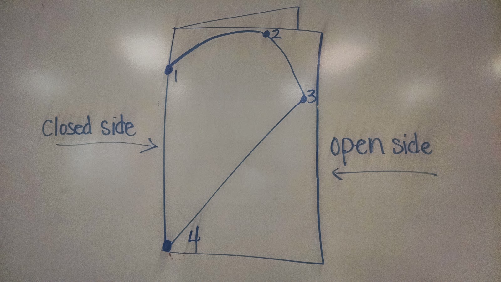
Once the concept of balance and symmetry was introduced, students created their own symmetrical balanced heart that has matching rather than lopsided halves. We first practiced on small 4"x4" red paper and then moved onto larger 12"x18" tag board. The first step was to fold our paper in half vertically (hamburger style). As a class, we discussed how our paper now has an open and closed side. On the closed side, students placed their five fingers (2 fingers for the smaller paper) pinkie at the top of the paper and made a dot below their thumb on the folded edge (closed side). 

Students drew half a heart starting with the dot along the edge and continued drawing their line to the top of the paper, to the far side, and back down to the bottom corner on the fold side. For students who had difficulty with this step, dots were drawn by the teacher and connected by the students (see photo below).

Once all papers were checked by the teacher for correctly starting and finishing on the fold side, students were able to cut on the heart line, cutting two papers at the same time, while the paper remained folded. If cutting and drawing were completed correctly, a symmetrical whole heart could be found when the students opened their papers. Sometimes, If I don't keep my eyes open, we could find two half hearts instead of one whole heart. This is what happens when students work on the open side instead of the fold side.
Oooops!
After creating our balanced and symmetrical heart shape, students then divided one half of their heart into sections by drawing straight lines from one side of their heart to the other side or from one black line to another black line with a black oil pastel to create a mosaic. The paper heart is then folded in half and rubbed with an old gift card to transfer symmetrical lines to the other half of the heart, ending with a mosaic effect. At the end of this week and next week, everyone will have the opportunity to paint inside each shape using tints and shades of one color (monochromatic color scheme). To make the paint values balanced and matching on both halves of the heart, students close their heart shape along the fold line after painting a shape. Students then rub to transfer the painted values to the opposite side of the heart making a "balanced" symmetrical shape.


When I purchase paint for my classroom, I rarely purchase secondary colors like orange, purple and green. I love color theory and really encourage my students to mix their own secondary colors, as well as any tints and shades they may need, even at the kindergarten level. For example, the heart below uses only purple and its tints and shades. To make purple, students must use the two primary colors red and blue in the right ratios to make purple. To keep it simple, students will only be working with a light, medium and dark value of one color. To use purple, it must be mixed from the primary colors, because I do not have any purple paint in my art room.
Crayola is not a sponsor of Art Teacher 101, but I really do like their paint! After the hearts are painted and dry, we will add them to a colored piece of construction paper matching the color used on the heart.

Friday, January 6, 2017

Winter Projects

Winter projects bring lots of excitement, chaos, and mess to the art room, but students have so much fun creating with new materials. Kindergarteners created snowmen from circular sponge stamps and white tempera paint on 4"x4" blue paper. Then, they built houses for their snowmen to live from popsicle sticks, wood glue and a splash of color using tempera paint. 

We also experimented with mini winter landscapes by tearing small 5"x6" drawing paper into three strips to create our foreground, middle ground, and background. One edge of each torn strip was traced with blue or purple chalk pastels, and then, smeared to give it a hazy look. Students overlapped the torn strips to create the illusion of hills and glued the strips in place to blue construction paper.


Second and first graders learned special tricks used by artists to create the illusion of space in their own winter landscapes such as overlapping, changing the size of objects (smaller objects in background, larger objects in foreground) as well as the placement of objects on the paper (Lower objects in foreground, higher objects in background), and changing the value of objects so it appears lighter and hazier as it recedes into the background.


Second graders used double loaded and dry brush techniques to create their trees, while first graders cut their trees for their winter landscapes from green construction paper.

Recycled Snowmen are a tradition in second grade as a winter project. It gives second grade students the opportunity to use glue guns safely and choose materials that would be most appropriate to use with glue guns or craft glue such as buttons, pom pom, fleece, sequins, scrap paper, etc.