95% of students from sections 2B and 2C will identify and demonstrate the illusion of space using specific art vocabulary: foreground, middle ground, background, horizon line, placement on paper (high/far and low/near) and size relationships (near/large and far/small).
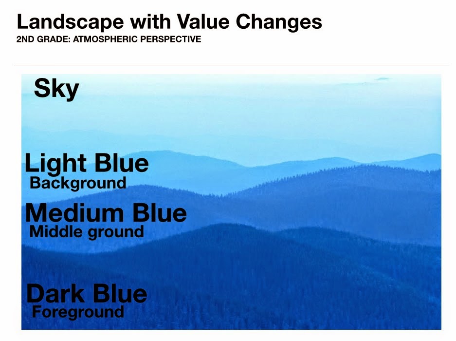
Today and tomorrow, 2nd graders will be playing a little "space" game to help identify the areas of space using the objects below. The objects need to be organized according to how artists create space in a landscape using value and size relationships. The large blue rectangle shapes are the foreground, middle ground, and background areas of space while the large, medium, and small tree should be overlapping the appropriate area of space; large tree on dark blue foreground, medium sized tree on medium blue middle ground, and small tree on light blue background.
The first graders and kindergarteners used the same shapes for a quick activity, but instead of working in pairs like the second grade group, I made two landscape boards on large 18 by 24 inch paper. On the large paper, I drew three lines and wrote the words foreground, middle ground, background, and sky to separate the areas of space.
 |
| Words on the left from bottom to top; foreground, middle ground, background, and sky. |
 |
| Some students thought blue was for sky, but were reminded that it was our ground color. |
 |
| Kindergarteners working in groups of 8-10 students. |
We looked at many examples of landscapes before completing this quick "space" activity. One of the pictures I used during my introduction was a landscape of blue hills at dusk. When students forgot that the blue rectangles were ground and assumed the pieces were part of the sky, I reminded them of the landscape from the introduction.
We also made a connection between Pieter Bruegel the Elder's "The Hunters in the Snow", painted in 1565, to Grant Wood's "Stone City, Iowa", created in 1930. Both are landscapes and both artists (although from different centuries) still used the same "space" skills we discussed to make parts of their paintings appear up close and far away.
Here are few quick videos (and when I say quick, I mean less than one minute) that I used as a resource to help demonstrate the "illusion of space" in art. I usually explain what to watch for within the video before even playing it, let them watch the video in its entirety, explain the items again to look for a second time, and replay the video a second time to maximize its effectiveness. There are other quick videos for the design elements and principles in the "Artist's Toolkit" to explore. My students love the quick videos because they have music and sound effects! I love the videos because they quickly and precisely teach an art skill!
 |
| http://www.artsconnected.org/toolkit/watch_space_overlap.cfm |
 |
| http://www.artsconnected.org/toolkit/watch_space_perspective.cfm |
SD Visual Arts Standards:
Anchor Standard 3: Refine and complete artistic work.
K.VA.Cr.3.1 Explain the process of making art while creating art.
1.VA.Cr.3.1 Use art vocabulary to describe choices while creating art (such as the elements and principles of design).
2.VA.Cr.3.1 Discuss and reflect with peers about choices made in creating artwork using art vocabulary (such as the elements and principles of design).
Anchor Standard 1: Generate and conceptualize artistic ideas and work.
1.VA.Cr.1.1 Engage in creative art making using observation and investigation.
2.VA.Cr.1.1 Brainstorm and implement multiple approaches, materials, and tools to solve an art or design problem.


No comments:
Post a Comment